Transform Your Saskatoon Living Space: Expert Tips for Choosing the Perfect Interior Paint Colors
Choosing the right interior paint colors can transform your living space from a simple house into a haven of comfort and style. However, in Saskatoon, where our latitude means the sun hits differently in July than it does in January, selecting the perfect hue is both an art and a science. As the experts at Brothers In Colors Painting Saskatoon, we’ve seen how the right color can counteract a dark prairie winter or celebrate a bright Saskatchewan summer.
This guide dives deep into the psychology of color, the unique lighting conditions of the Bridge City, and practical steps to ensure your next painting project is a resounding success.
The Psychology of Color: Why It Matters in Your Home
Before you pick up a brush, it’s essential to grasp how colors affect mood. In a city where we spend significant time indoors during the colder months, your wall color is the “backdrop of your life.”
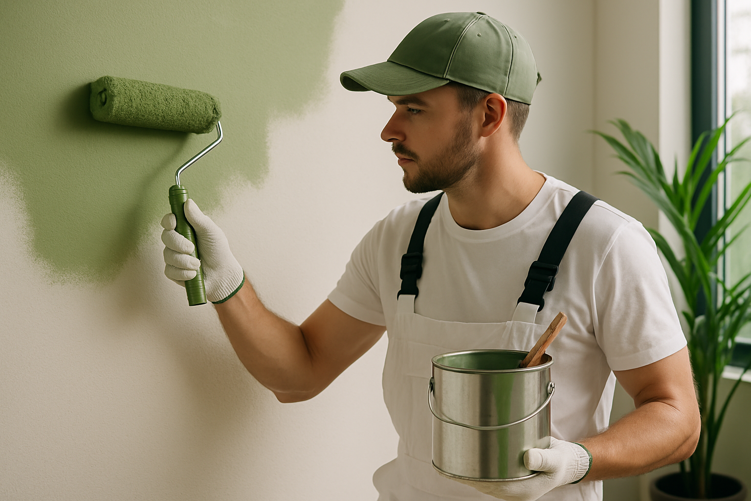
- Warm Tones (Reds, Oranges, Yellows): These create a cozy, energetic environment. They are perfect for social hubs like kitchens and living rooms in neighborhoods like Stonebridge or Evergreen.
- Cool Tones (Blues, Greens, Purples): These have a calming, restorative effect. We highly recommend these for bedrooms and home offices where focus and relaxation are priorities.
- Modern Neutrals (Beiges, Grays, “Greiges”): These offer maximum versatility. In 2026, we are seeing a shift toward “Earthy Neutrals”—think warm terracotta or muted moss—that bring a touch of the Saskatchewan outdoors inside.
1. The Saskatoon Lighting Challenge: North vs. South
One of the biggest mistakes homeowners make is choosing a color under the fluorescent lights of a hardware store. In Saskatoon, natural light is your best friend—or your worst enemy.
North-Facing Rooms
These rooms receive a cool, bluish light. If you paint a north-facing room a cool gray, it can feel like a “refrigerator.” To balance this, opt for warmer tones like “Mocha Mousse” or a creamy off-white to keep the space inviting.
South-Facing Rooms
These rooms are flooded with intense prairie sun. They can handle bold, saturated colors or cool tones like “Quietude” (a soft sage green) which prevents the room from feeling “too hot” during a July afternoon.
2. Why You Must Use Real Paint Samples
Don’t rely on a 2-inch paper swatch. At Brothers In Colors, we recommend our professional color consultation. We suggest painting a large “test square” on different walls. Watch it at 8:00 AM, 2:00 PM, and 8:00 PM under your LED or warm-bulb light fixtures. A color like “Encore” (an atmospheric deep blue) can look sophisticated in the morning but moody and dark at night.
3. Harmonizing with Saskatoon Character
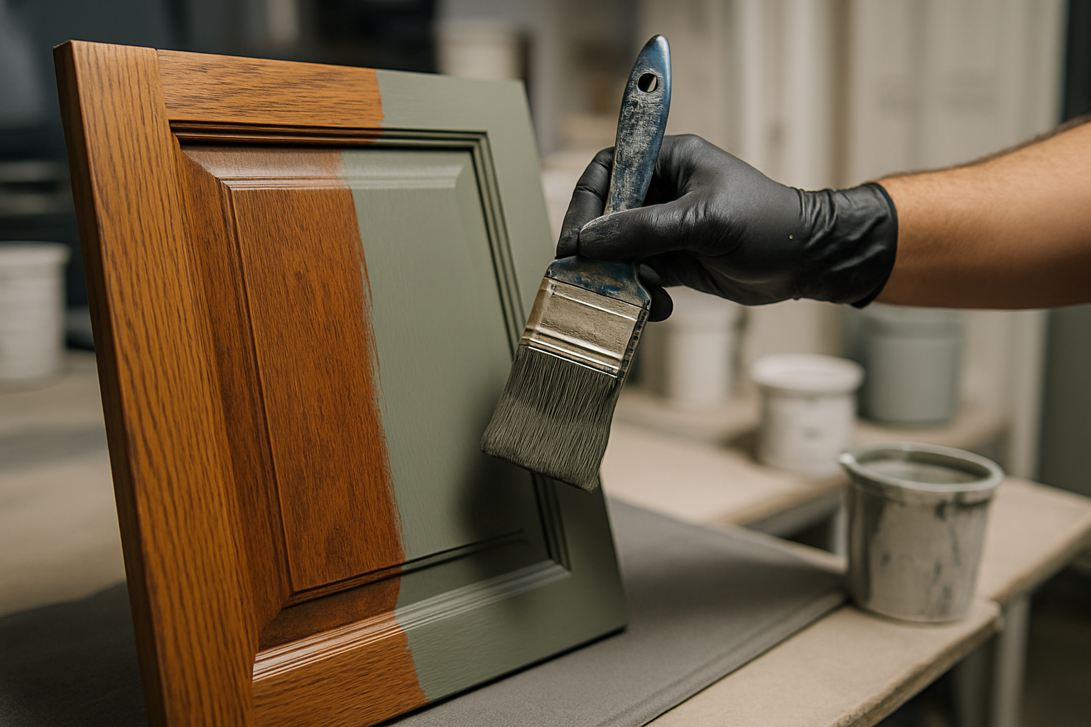
Are you living in a heritage home in Nutana or a modern build in Brighton? Your home’s existing elements—hardwood floors, stone fireplaces, or dark cabinetry—must dictate your palette. For homes with dark wood trim, a color like “Cinnamon Slate” (a blend of heathered plum and velvety brown) can create a high-end, cohesive look that feels intentional and expensive.
4. Beyond the Walls: Drywall and Trim
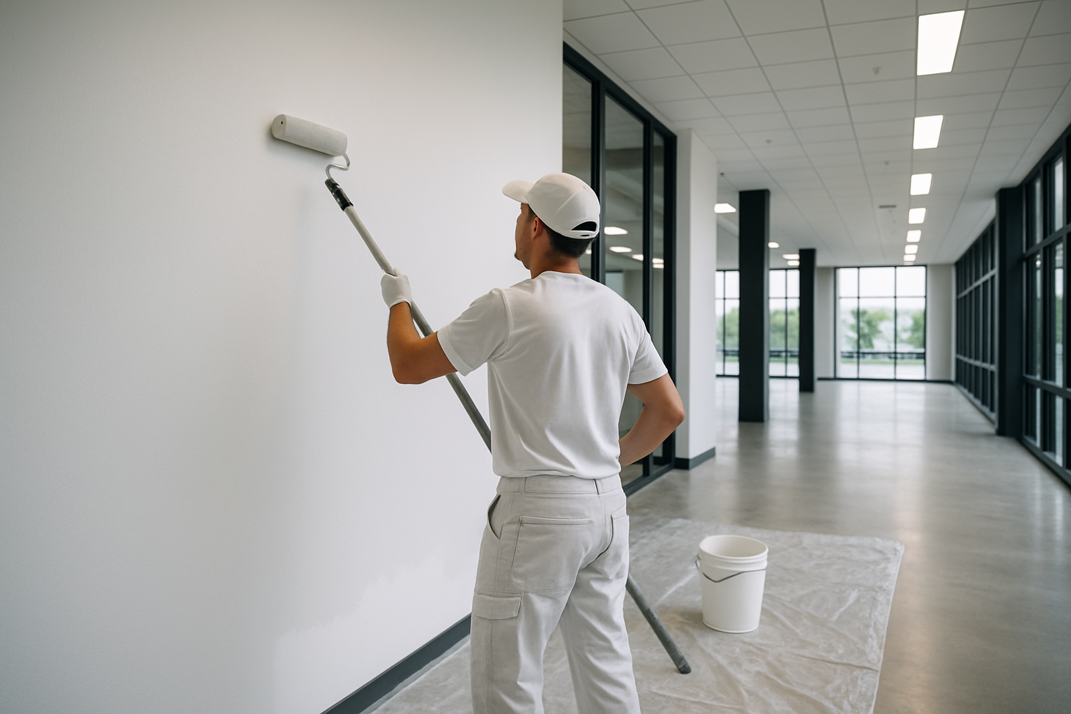
Even the most beautiful color won’t hide a poorly maintained wall. Before we start any interior house painting in Saskatoon, we address the foundation.
- Drywall Repair: Our drywall repair and painting services ensure that cracks from house settling (very common in new Saskatoon builds) are erased before the first coat of paint is applied.
- The Trim Factor: Professional trim and baseboard painting provides the “frame” for your colorful masterpiece. Using a high-quality finish on your trim makes the wall color pop and increases your home’s resale value.
5. The Eco-Friendly Standard for 2026
As dedicated eco-friendly painters in Saskatoon, we prioritize Low-VOC and Zero-VOC paints. These products, like the Super Hide Zero VOC line, are better for the environment and safer for your family, especially during the winter months when windows remain closed. You get a premium finish without the “fresh paint” fumes.
Common Mistakes to Avoid
- Ignoring the Sheen: A matte finish hides wall imperfections but isn’t great for high-traffic hallways. A satin or semi-gloss is better for kitchens.
- Matching Too Perfectly: Your walls shouldn’t be the exact same color as your couch. Aim for complementary colors rather than exact matches to give the room depth.
- Skipping the Primer: Especially when going from a dark color to a light one, primer is non-negotiable for a professional result.
Ready to Refresh Your Home?
Choosing colors should be exciting, not stressful. Whether you’re looking to update a single room or undergo a full home transformation, the team at Brothers In Colors Painting Saskatoon is here to help. We combine local expertise with premium finishes to deliver results that last.
Contact us today for a free painting quote and let’s bring your vision to life!